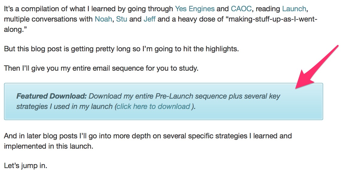
|
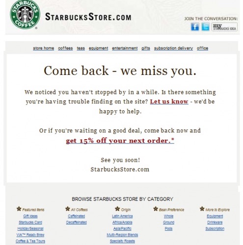
Getting prospects to convert to customers is one thing. But how do you get customers to buy again and again after the first purchase? This is where attentive, customer-focused emails come on. Despite some heralding the death of email over more modern platforms like texting and social media, good, old-fashioned email remains one of the best ways to seal the deal, engage customers and encourage repeat purchases. So what kinds of emails should you send? How often should you send them, and what should they contain? Here are a few of the best examples of e-commerce follow-up emails and why they work so well. The Repurchase ReminderOftentimes, when you make a purchase on a website, they email you immediately after encouraging you to buy again. This marketing strategy is rooted in the idea that customers are likely to come back and purchase while your brand is still fresh in their mind. But oftentimes, companies send emails out immediately and when the customer (naturally) doesn't respond, they no longer follow up. If your repeat purchase numbers are flat-lining and your emails are stale, why not wait until more time has passed (depending on how often the customer uses the product) to remind them? Here's a great example from Sephora, which reminds the customer to restock based on how much time has passed since their first purchase: 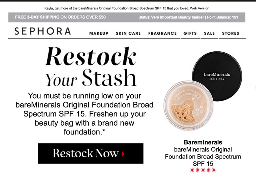 Another creative spin on the restock email comes from Clinique. Since their data likely shows that women tend to shop online for beauty products more than men, they wouldn't have as much luck sending a shaving gel refill reminder to men - so they advertised a refill reminder for him, to her. See how they did it:  We Miss You!One alternative on the restock/repurchase follow-up email is tailored to the bargain hunter, like this email from Starbucks. There's no better way to stay top-of-mind than with a coupon, and many customers actively wait to purchase until they get a deal. Knowing this, why not reach out with a discount?
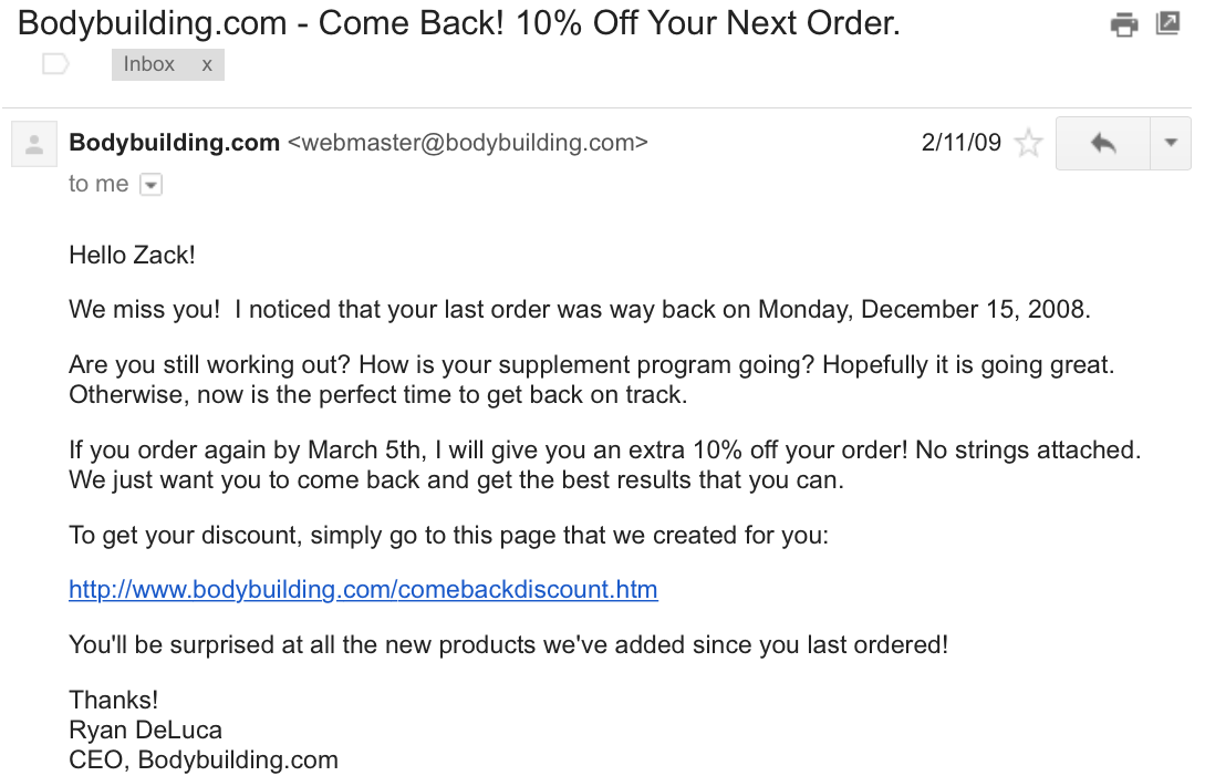
Bodybuilding.com sends customers an email if they haven't repurchased after about 3 months:
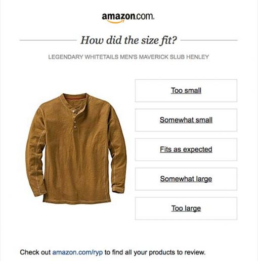
Another common tactic is to follow up with customers asking them to review their recent purchase. Again, this is extremely common and almost expected - but customers don't always have the time at that very moment to write up a lengthy review. So how do you get them clicking? Here are some creative ideas that take feedback to a new level. Going Beyond How Did We Do?For the customer who doesn't have time to write up a huge review, but the company still needs their feedback data to work with, I present to you the Amazon 1-click review:
Of course, you've likely received plenty of emails asking for your feedback, and even some that go the extra mile by giving you a discount coupon, entering you into a contest and much more. But this one is noted for its pure simplicity plus its unobtrusive style. It doesn't get in the way - one click and you're done. And speaking of Amazon, you already know that they're the e-commerce leader simply because of how much they test, monitor, tweak and track everything about their site. One of the more famous changes was adding in the Customers who bought X, also bought Y feature. Now much more commonplace on e-commerce sites, this Frequently purchased together option often encourages greater purchase volume per customer. But what happens when they don't purchase all of the items together? Is emailing them about it a lost cause? Not exactly Frequently Purchased Together (But It's Not What You Think!)Not all Frequently Purchased Together emails have to be a sales pitch. And if the customer didn't buy them when they were originally presented, there must have been a reason. Of course, the reasons why customers choose not to buy could be a whole other blog post in itself, but knowing what you know, why not steer the customer more toward educating them about the product add-ons or accessories rather than simply presenting them?
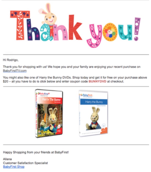
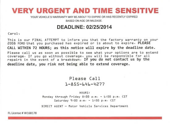
Since, in the example above, the customer is shopping for baby-friendly TV shows, the company naturally recommends a couple of DVDs that a baby or toddler might like, as well as a coupon and directions on how to get it for free. The Warranty Expiration NoticeThis type of email normally applies in cases where you sell parts or electronics that are under warranty. When making a purchase, customers sometimes don't opt for the extended warranty, preferring to rather stick with the original manufacturer's timeframe. But reminding them that the original manufacturer's warranty has almost expired, and inviting them to extend the protection on their purchase might be just the thing they need to keep their original purchase in good working order:
Here's another example offering an enhanced warranty on a lamination machine:
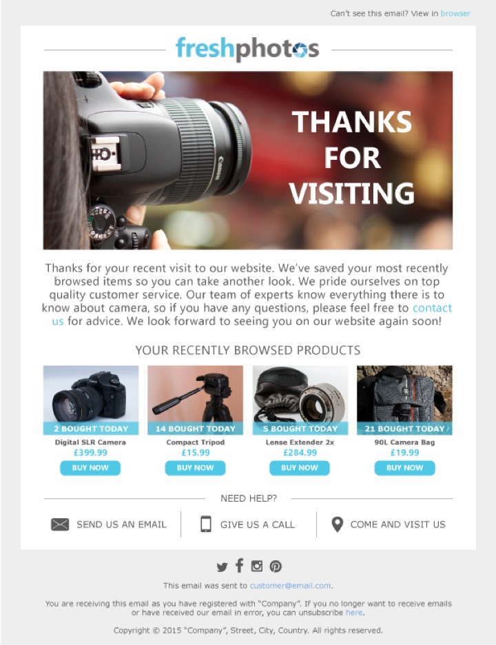
The Just Looking ReminderWith all of the email examples showcased so far, you'd need the appropriate data based on what the customer bought previously. But what if they haven't bought yet, and are only looking? Are you out of luck? Not at all. Provided you have the prospect's email address, you can still send them reminders, even if they haven't added a product to their cart:  Here's another example that reminds the user of the products they browsed in case they want to take another look and don't want to have to sift through their browser history:
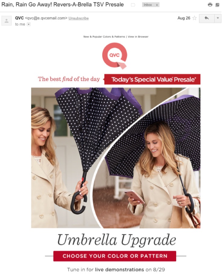
Use Demographics to SellAs opposed to many of our other example, these emails do not rely on previous purchases. They start fresh with new product recommendations based on the demographics. For example has it been raining in Minnesota for the past few days? Find all your prospects located in Minnesota and send them an email showcasing your umbrellas.
Many of your prospects are likely either searching for one because a) they don't have one or b) the one they have is old, has holes, etc. This can go beyond weather. Many political radio broadcasts will have doomsday meals when the inevitable apocalypse comes. When Barack Obama was president, Glenn Beck and many other conservative pundits advertised 4-week emergency food supplies:
Does this profit off irrational fears? Yes. But it also means understanding your audience. If they're afraid, what are they willing to buy? Sell it to them. If it's snowing, what are they willing to buy? Offer it up for sale. Marketing is all about targeting the right people, when they are most receptive to your product. What better products to advertise to those that fear end times are near? New Product Recommendations Based on Past PurchasesFinally, we have the new product recommendations email. Rather than always notifying customers every time you have new items in stock (and hoping they might like some of them), why not segment the new product announcement emails based on what the customer has purchased previously? They're much more likely to buy, and they'll welcome the added personalized attention! Despite the different products and industries, all of these emails have one major thing in common - and that is a dedicated - almost fanatical attention to customer orders, browsing habits and preferences. And although you may be doing a great deal of e-commerce by email, there are still, as these emails demonstrate, new ideas and approaches that can be capitalized on. Do it all with Kissmetrics CampaignsKissmetrics Campaigns is a behaviorally-triggered email platform. Combining our behavioral analytics with Kissmetrics Campaigns makes it easy to find segments that need converting, and targeting them is done in a few steps. And best of all it's all done within Kissmetrics. There's no need to export and import lists and mess around with APIs or databases. It's all done in the same platform. And if you are using these strategies in your email announcements and customer lists, how have they worked for you so far? We'd love to hear your thoughts and comments. Share them with us below! About the Authors: Sherice Jacob helps business owners improve website design and increase conversion rates through compelling copywriting, user-friendly design and smart analytics analysis. Learn more at iElectrify.com and download your free web copy tune-up and conversion checklist today! Zach Bulygo (Twitter) is the Blog Manager for Kissmetrics.
0 Comments
Four Lessons Learned From Bootstrapping #Products via @bugfenderapp https://t.co/jcpqmpxWX39/27/2017
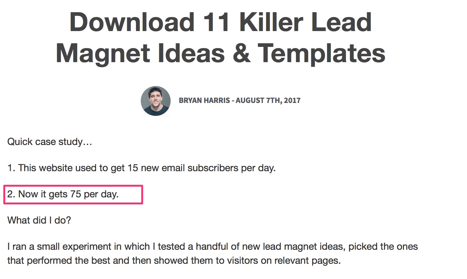
I am a big champion of the power of email marketing. There's no better way to build a community and nurture a relationship with your audience. It's hands down the most authentic way to prime your prospects, sell them your work, and grow your revenue. So, when a powerful list-building techniquecomes along, I get excited. After all, a thriving email list is the foundation of email marketing. I'm sure you've noticed this, but I'll point it out anyway. Content upgrades are what's hot right now if you want to accelerate the growth of your email list. Take a guy like Bryan Harris, for instance. He sees a conversion rate of 20-40% on blog posts with content upgrades. He now averages almost 80 subscribers a day.
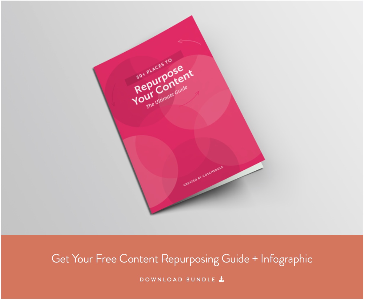
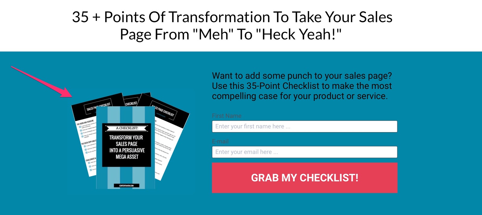
That's amazing! Blog posts typically do not convert as well as landing pages because they're not designed for that purpose. The point of a blog post is to educate, entertain, and inspire. There's too much going on to get someone focused enough to sign up to your email list. Content upgrades have changed that completely. You can now transform your blog posts into powerful list-building assets. All you have to do is uplevel your posts with a targeted free resource. Don't worry-I'll show you how. First, let's define a content upgrade. What is a content upgrade?It's a type of lead magnet you give your audience in exchange for their email addresses. The typical lead magnet, like an ebook or an email course, stands alone. It is not attached to any specific piece of content. It has its own thing going on. A content upgrade is unique to a piece of content. It's usually tied to a blog post. But there are other types of content you can uplevel with a free resource. Webinars, podcasts, and videos are examples. The point is to enhance the value of your content with this additional resource. As you can imagine, there are several ways to achieve that. You can create a resource that helps readers implement what you just discussed. An action sheet, workbook, or toolkit are excellent examples. You can give away something that saves them time, like templates or cheat sheets. The ultimate strategy is to create something that will help them delve deeper into the topic. This is where you give additional strategies, tutorials, case studies, etc. Your options are endless. Let's look at some examples. CoSchedule published a post How to Repurpose Content and Make the Most of Your Marketing. The content upgrade? A content repurposing guide and infographic:
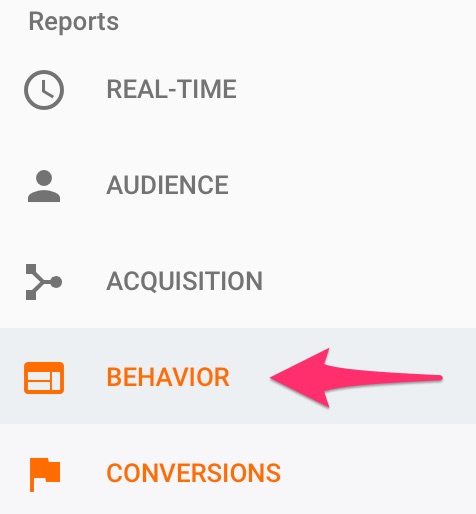
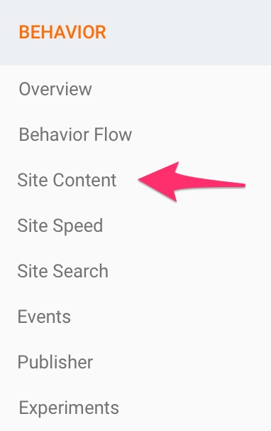
If you read this post and were interested in implementing this content repurposing technique, you'd sign up for this upgrade in a heartbeat. And that's why content upgrades are so powerful for growing your email list. They offer something you can't say no to: value. I'll give you more examples later. For now, let's get into how you can create your content upgrades. Step #1: Identify your top-performing contentCan't you just create content upgrades for your new content? Yes, but it's not where you should start. If you haven't created upgrades, you should first capitalize on the traffic you're already receiving. This is the fastest way to see results. You can identify your top posts with Google Analyticsor Buzzsumo. If you have GA fired up, go to the Reports section and click on behavior.
Go to site content and then all pages. You'll find the website pages with the most traffic.
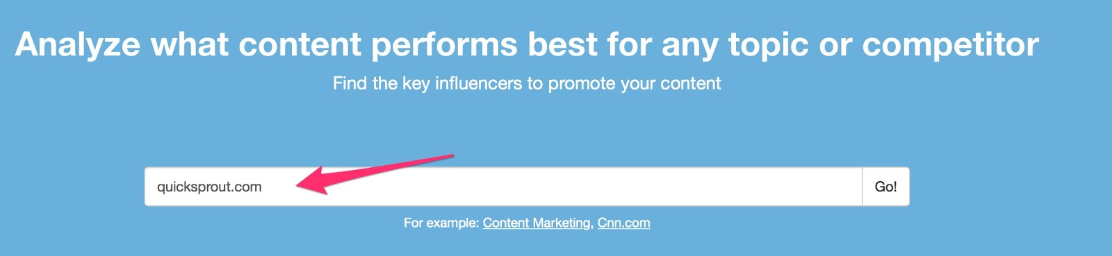
You can also find this info directly from your WordPress dashboard if you have GA set up there. Buzzsumo is even simpler. Plug in your site URL and press Go.
You'll find the posts with the most social shares. Record these in a spreadsheet. They'll serve as your targets for your new content upgrades. These are for finding your top blog posts, but the same can be done for your podcasts, YouTube videos, webinars, etc. Step #2: Find the gap in your contentTo deliver that extra value, you need to pinpoint the gap in your content. Otherwise, your upgrade won't be worth opting in for. Select one of your top content pieces found in the first step. Go through it from top to bottom, and consider the following questions. Q. 1: What problem does your content solve?If you've created something of quality, it should solve a problem. I understand not all content is instructional or how-to, but the question remains. Think about what knowledge you're trying to deliver and what purpose it serves for your audience. Let's look at this post.
My goal is to give readers the fastest and easiest strategies to grow their email lists. If I were to create a content upgrade for that post, it would:
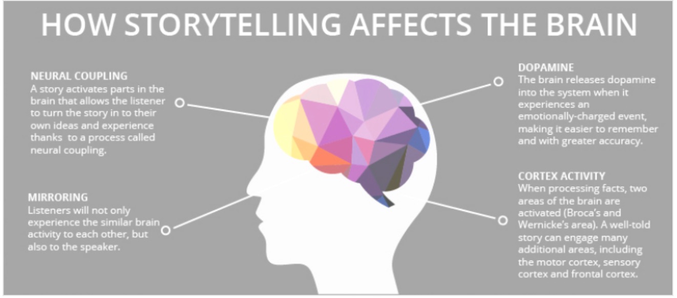
This may sound futile. But without going through this exercise, your content upgrade can flop. When I talk about types of upgrades later, you'll understand why. For now, figure out what your content is trying to accomplish. And your job will be half done. Q. 2: What's missing?You know the goal of your content piece. Is there a strategy you didn't mention? A tool required to implement your tactics? Something that fulfills the goal but was not covered in-depth or at all? Find the gap between the objective and what your content does. Q. 3: How can you expand the value?Think of what could've been included to make your content more valuable. You want an upgrade that accomplishes the same goal you established earlier, but with an extra kick. When people consume new information, they're thinking of the ways they can implement it for a positive result. Your audience wants to achieve that outcome better, faster, and cheaper and with more precision, less error, and less effort. That's the purpose your content upgrade should serve. What content do you plan to create in the future? If you want to make upgrades a key piece of your list-building strategy, here's what I recommend. Don't wait till after you've created your content to come up with an idea for your free resource. Instead, strategize the future upgrade. How? Leave an open loop. This technique uses the power of storytelling to get readers excited about your content upgrade. Here's what storytelling does to the brain:
How do you achieve that? Briefly mention a tool, a topic, a relevant experience, or an action step in your article. Don't expand on it in your post. Just mention it, and leave the gap wide open. This way you're giving people a piece of the story-not the whole thing. The objective is to hook your readers. Then, create an upgrade that closes this gap. I guarantee you, people will sign up to your list just to get the inside scoop. With this technique, you're utilizing curiosity, a major persuasion factor. Step #3: Select an appropriate type of content upgradeNow that you know what content you'll cover, it's time to establish the form. How will you deliver your content? Many people don't give it much thought. They believe the content is the end-all and be-all. Not true. Content and delivery go hand in hand. Imagine you promise subscribers a quick win, and you deliver your content in a 30-day email course. There's nothing quick about a 30-day email course. But that doesn't mean this form isn't appropriate for a different result. Let's say you promise advanced in-depth training, and you deliver it in a cheat sheet. The email course would serve your audience way better in this instance. It's why I use it. It works.
You could also use a webinar.
Do you see how the type of upgrade you select can conflict with the actual content? You want the two to work seamlessly. Otherwise, your subscribers will feel cheated when they receive your resource. The result? They unsubscribe and never return to your blog again. This is why I placed emphasis on establishing your goals in the beginning. It's going to help you select the right type of content upgrade. Here are the options available:
These will give you enough food for thought. Ensure you select the form that aligns with your content and its goals. Step #4: Design your content upgradeYou've got your content figured out. You've got your delivery method aligned with the content. This is where you might have some problems. Or maybe not. Designing a lead magnet can be time-consuming and challenging for some people. For others, it's a breeze. Here's the thing. It doesn't have to be overwhelming for anyone. Even if you don't have one technical or creative bone in your body, you can do this. And if you don't want to, you can outsource it for pretty cheap. That's why sites like Fiverr, 99Designs, and UpWork exist. For those who want to handle it themselves, here's how. First, I'll tell you my favorite tools:
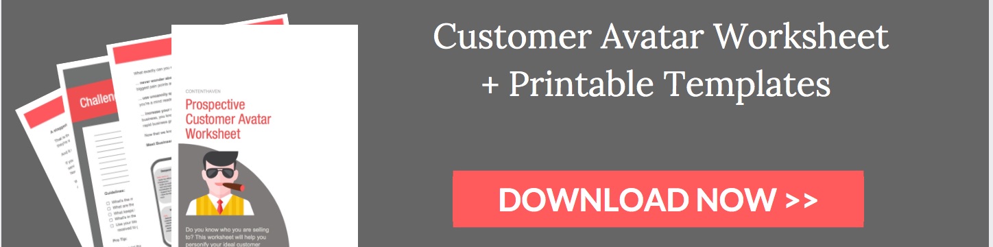
That's it. The best part? These are free to use. Here's an overview of how you can do this. Step #1:Outline the content for your upgrade in a Google Doc or Word documentWhether you're creating an ebook, ecourse, or cheat sheet, write out the most important points. This will serve as a skeleton for your content upgrade. Step #2: Expand on your outlineFlesh out your main points. I like to use dictation to get through this faster. This way, you can just speak about your topic and let the tool do the typing. Go through it with a fine-tooth comb to make sure there are no errors. Step #3: Use Canva or Beacon to create a beautiful layoutYou can also do this with Google docs. You can copy and paste images, icons, create tables, and highlight text to create a sophisticated design within a simple document. Then, download your document as a PDF. But if you want to step up your design, Canva and Beacon are the best choices. Step #4: Create an image of your content upgradeThis is so you can place it within your blog posts or on a landing page. One of my favorite tools to do that is Skitch. I use it to take a snapshot of the individual pages of the content upgrade. Then, I overlay them in Canva to create an image. Like this:
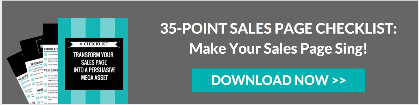
Step #5: Create a compelling call to action image to place within your blog postsAgain, you can use Canva to do this. Here are some examples:
Here's another:
It doesn't have to be fancy. You can use a feature box like this:
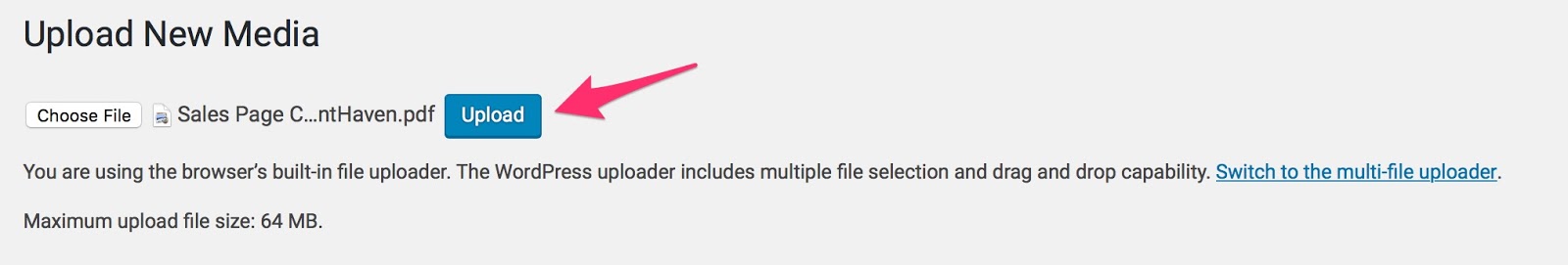
Step #5: Set up the delivery of your content upgradeAt this point, you should have all the assets created for your upgrade. The task now is to set up delivery. Step #1: Host the file in WordPress or with your email management softwareSome email systems, like ConvertKit, allow you to host files. This makes it super simple to deliver them to subscribers. The alternative is to use your WordPress account. Go to your dashboard, find the Media tab and Add New. Upload your file.
You'll receive a downloadable URL (file URL). Anyone with the link can now access your content upgrade. Step #2: Set up a follow-up email in your email management systemThis is what you'll use to deliver your content upgrade. Place the link you got in Step #1 within your email. At this point, you can set up a system to segment subscribers. Let's say someone opts in for a content upgrade on list-building. You can tag them to be transferred to a separate list designated for people interested in this particular topic. Most email software allows for segmentation. When you segment subscribers this way, you are better able to deliver emails aligned with their interests. It keeps them engaged and your unsubscribe rate low. Step #6: Promote your content upgrade and watch your list growThe only thing left to do is to promote your content upgrades. The goal is to get them in front of as many eyes as possible. Place them prominently within blog posts. Do it several times. When you share your content on social media, let people know there's an additional free resource that comes with it. A good way to promote your upgrades is to repurpose them. It's not necessary to create a new resource for each piece of content. If you're covering the same topics, your upgrades will be relevant to other content you create. ConclusionIf you really want to take your list-building up a couple of notches, content upgrades are a must. They enhance the value of your posts and give your audience a reason to hop on to your email list. In some instances, content upgrades are more powerful than stand-alone lead magnets. Why do people shy away from them? It can appear to be time-consuming and complicated. In some instances, that's true. But if you follow the steps in this article, you'll have everything you need to quickly and painlessly create content upgrades. Why not transform every piece of content into a list-building asset? That's the kind of transformation that impacts your bottom line. Try it out, and watch your email list numbers go through the roof. Do you have any tricks for creating high-converting content upgrades?
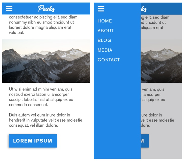
93% of Internet users browse the Internet on a mobile device every day. That's 3.5 billion people who could potentially be seeing your website on their phones or tablets at any given time. It follows, then, that you should be working as hard as you can to optimize your online presence for mobile. Trust me, there's nothing worse than having a marketing funnel that's totally ineffective on non-desktop devices. To give you some guidance, I've put together 8 mobile design best practices you need to be following. They'll help you streamline your visitors' user experience, maximizing the impact of your marketing funnel for any device. 1. Get Rid of Your NavbarOn mobile, real estate is at a premium I think of my iPhone screen like a map of downtown Manhattan, where every pixel costs a pretty penny. Check out how much space a mobile navbar can take.  This means you need to maximize what you're getting out of your website on mobile. One easy way to do this is to drop your navbar on mobile. On a laptop or desktop, your navbar can be incredibly helpful it's a simple way for your visitors to browse the pages on your site, making it simple for them to find exactly what they're looking for. But on mobile, your navbar can take up a ton of space that could otherwise be used for text, images, or whatever other content you have on your website or landing pages. Now, you might be wondering how visitors are expected to browse your site without a navbar. There's a few ways around this The most popular way is to incorporate a hamburger menu, which allows you to create a much smaller (but still branded) top bar. The hamburger menu acts as a drawer, pulling out from the left side of your screen to show the various menu items in your navbar.
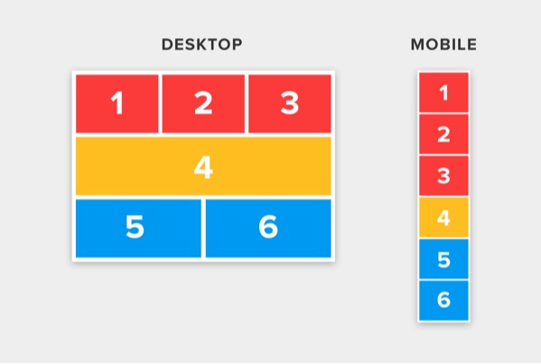
Or, depending on the size of your webpages, you might opt to create a single-page layout for mobile devices. However, unless your website is relatively sparse content-wise, this probably isn't the best option for your business. 2. Keep Important Elements Within ReachThink about the time you spend on your smartphone. I'm willing to bet you use it pretty often maybe while you're on the bus or waiting in the line at Starbucks (or perhaps reading this article, right now?). Now, think about how you hold it. If you're like most of us, you're only using one of your thumbs to interact with your screen. You're not alone: according to a recent study by mobile UX expert Steve Hoober, 75% of people only use one thumb to interact, too. Years ago, the diagram below was a bible for mobile designers, giving them insight into how they should lay out content to optimize user experience for the majority of website visitors.  Though the above may have been accurate at the time, things change quickly (and in technology, even quicker). In the last few years, our phones and screens have been getting bigger and bigger but our hands are staying the same. The way we hold our phones has changed as such, screen hot spots have shifted, with touch accuracy dropping as we approach the screen's outer edges. 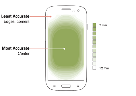 As a result, we as designers need to organize content in a way that puts primary interactions front and center, saving secondary and tertiary functions for the top and bottom screen edges.  The position of these functions relates directly to ease of access for a user. Primary functions lie in the area that users can access easily with their thumbs, while tertiary (and to some extent, secondary) functions lie in lower-accuracy zones and require a little more work to get to. 3. Optimize and Minimize File SizesYou're probably already aware of how important it is to optimize the size of the images on your website. They drastically affect load time, which has a cascading effect on both user experience and the search ranking of your pages. This is doubly important on mobile. Not only are connections less reliable on mobile, but also mobile users don't like waiting. That means if your page isn't loading quickly, they probably won't stick around to let it finish. Use a site like TinyJPG, or tools like ImageOptim (Mac only) or Photoshop's Export for Web to make sure you minimize the file size of your images before you upload them to your website. There are two primary properties that affect file size:
4. Link Phone Numbers and AddressesOptimizing for mobile is all about streamlining a visitor's experience. It should take them as few steps as possible. This means taking advantage of interactions on mobile that will help make visiting your website (and buying your product or contacting your business) a pleasant experience. If your website is sales-reliant or if phone is an important touchpoint in your marketing funnel, one of the most important things you can do is make it easy for people to call you. One simple way to add value to your contact us page is to make your phone number a clickable link. Everybody knows the pain of frantically swapping back and forth between your phone and browser apps to type in a phone number, or trying to copy it and accidentally copying all of the other content on the page, too. Trust me, making your phone number clickable makes a big difference. All you need to do is link your phone number like this:
And it will appear like this: This will allow users to click to call. In the same vein, you'll want to make sure other important details are interactive as well for example, clicking your address should open up a visitor's Maps application. Though most apps like Facebook will automatically set this up, you can type your address into Google Maps and copy the Share link to link it to the address on your website. 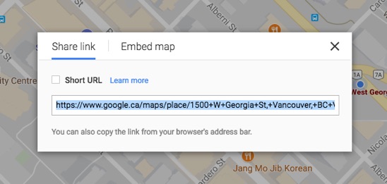 It's these little things that help make visitors feel like they're not missing out on anything when they visit your pages on mobile, and it saves them from having to do extra work. To put it simply, don't let your mobile browsing experience choke your marketing and sales funnels. 5. Design for ResponsivenessIf you were around during the advent and uprise of the mobile web, you might recall that most websites actually built entirely new layouts for mobile that would work for the smaller screens of the pre-iPhone era. These pages often featured minimal images, and were relatively text-heavy to combat the slow browsing speeds mobile users received on their non-3G, non-LTE, non-WiFi networks. Fast-forward about ten years, and the mobile landscape has changed entirely. Screens are huge, internet connections have quickened, and tablets exist. These advancements (and other advancements in front-end design languages like CSS) have paved the way for responsive and adaptive design. Though there are nuances between these two types of design, their principal purpose remains the same: create a single website layout that responds and changes dynamically based on the device each visitor is using.
Hopefully, the webpage template or landing page editor you're using will automatically create a mobile-responsive version of your page as you build it, removing the hassle from you or your designers to manually create it. There are a few things to keep in mind when we consider responsiveness:
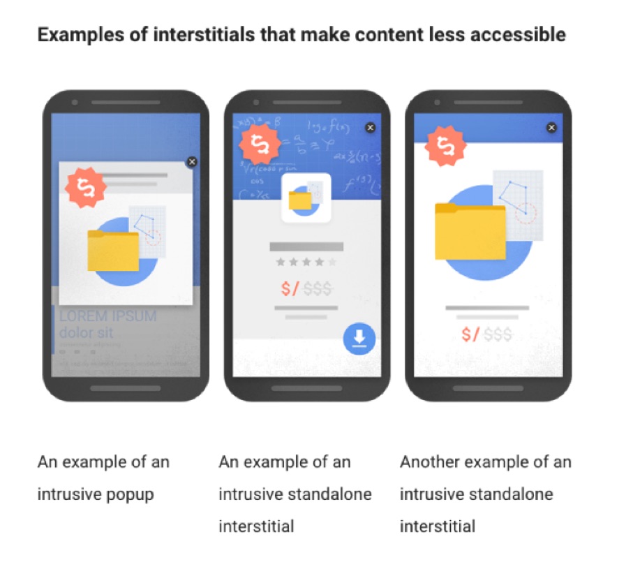
6. Disable PopupsIn 2017, Google rolled out their soft penalty for what they call intrusive interstitials. In layman's terms, this pretty much means popups. Here are a couple examples straight from the horse's mouth.
Basically, having popups show on your webpages on mobile devices greatly detracts from user experience, as visitors are unable to access or see the content they've clicked to find. To combat this, Google is penalizing pages with popups by reducing their search ranking, to discourage people from adding popups to their sites. The simple solution? Disable popups on mobile. Seriously just turn them off. Allegedly, some user-triggered popups like scroll or click popups aren't penalized but I can't find anywhere that confirms this, so take it with a grain of salt.
If your popup is rather important, add the content in as a section on your page, within your content (or even above the fold). This will stop Google from penalizing your site's search ranking. 7. Optimize Forms for MobileIf you've ever done some online shopping on your phone, you probably know how frustrating it can be to fill out form after endless form. While the overall typing experience on mobile has vastly improved from the days of T9, it's still not perfect. It relies heavily on autocorrect, and can still be quite taxing on the thumbs. What's the lesson here? A simple syllogism: long forms require a lot of typing. Typing sucks on mobile. Therefore long forms suck on mobile. If you want to try to minimize the negative effect mobile might be having on your conversion rates, try making one of the following changes to your form fields. Reduce the number of form fields on your pageIt's simple reducing the number of form fields a user needs to fill out greatly reduces their perceived workload, which can help in reducing visitor friction. 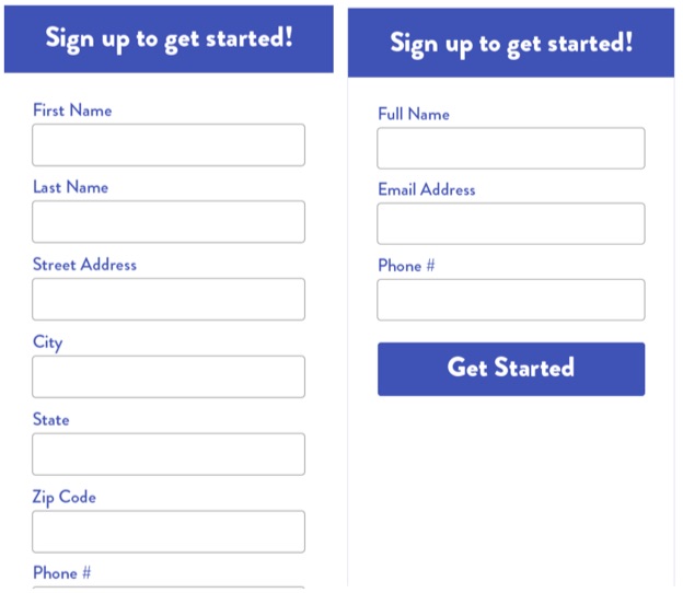 Though this isn't always a viable option often, form fields are there because they're necessary reducing some of the less necessary ones (last name, maybe?) or combining multiple form fields into a single field (first and last name, for example) can make a big difference. Break up forms into multiple stepsSegmenting your form into multiple steps can help you increase conversion rates on mobile. For example, if you have 9 fields, you may want to put only 3 in the first step. When a user fills out these 3 and presses the form submission button, they're taken to the next page to fill in a few more fields, and so on. 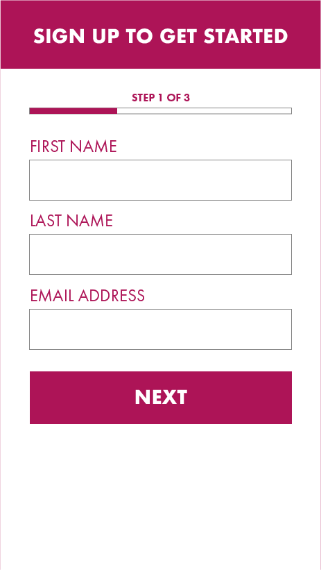 This not only makes converting on your form seem less intimidating initially, it allows you to collect lead information in small bits from your visitors, which can help you if they eventually bounce from your form. I'd recommend collecting at least email on the first part of your form, so you can market to them in the future. 8. Utilize Collapsible Sections/AccordionsWhen your content has all been collapsed into a single column on a smaller screen, it's going to end up being much longer. This is an issue on mobile because it suddenly makes it much more difficult for a visitor to navigate and find what they're looking for. An elegant solution to this is to utilize collapsible content sections, otherwise known as accordions. 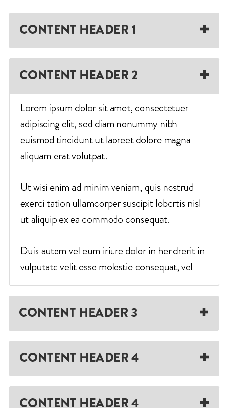 Accordions are containers that hold content; they show up as only a header and expand once a user taps on them. This allows your visitors to skim your page for the content or topic they're looking for without needing to sift through a ton of copy and images. You'll need to do a bit of front-end work to put together an accordion, so get your designer or developer on the line! Wrapping it upHopefully, these mobile design tips have given you some insight into how you can streamline user experience for the people who visit your website (or landing pages) on mobile. These are things that are often overlooked, which can lead to a significant decrease in conversion rates on non-desktop devices. Follow these tips, and I can guarantee your mobile visitors will have a better experience with your site, making them more likely to convert. Good luck! About the Author: Carlo is a digital marketer and designer at Wishpond. When he's not creating content or A/B testing, he enjoys making music, drinking copious amounts of coffee, and shopping for sneakers. Follow him on Twitter and Instagram @carlonathan. Below is what happened in search today, as reported on Search Engine Land and from other places across the web.
The post SearchCap: Smart speaker stats, link building AI & Google doodle appeared first on Search Engine Land. Please visit Search Engine Land for the full article.
|
ABOUT USTargeted Laser SEO provides SEO for surgeons, lawyers, and medical entrepeneurs, medspas, and spas. With an emphasis on local SEO and affordable SEO service packages for our clients, we are able to combine cutting-edge and innovative strategies to help our clients get ranked online in the most advantageous positions. Archives
June 2019
Categories |


 RSS Feed
