|
Human attention spans are embarrassingly bad. I'd have to be lucky to get just 5% of people to read this entire post. Most probably won't get past the intro, so I'll get to the point: In this age of infinite distraction, brands that can keep their customers engaged with the product are bound for long-term success. Fads come and go (by definition) and companies have short lifespans. Here one day, closed (or acquired) the next. Brands that will succeed are the ones that keep customers engaged and re-purchasing. Companies like Netflix, Facebook, and Amazon succeed, in part, because they keep users engaged. Netflix keeps producing great content, which keeps people coming back. Facebook has a great, addictive product that billions of people use everyday, and Amazon has made billions off keeping customers to come back and make more (and more) purchases. To keep customers engaged, they'll need to be informed on what they're missing without you. To do that, you can send behaviorally-targeted emails towards the relevant group of users. Here's how to spot your unengaged users, and get them re-engaged. And this is all done with Kissmetrics. Just What the Heck is an Unengaged User?Before we dive into the hows, we'll first need to know what an unengaged user looks like. There are active users and there are engaged users. Active means they have logged in. Even if they login, stare the screen for a few minutes, and leave they can be considered active. An engaged user is one who uses the product in a meaningful way. They use features, comment on statuses, send messages, and share photos. Each product will have different conditions of what makes an engaged user, but one thing is for sure they need to be using the product and interacting with it, not just logging in. We'll use a SaaS company as an example in this post. And we'll set our definitions of unengaged and engaged customers:
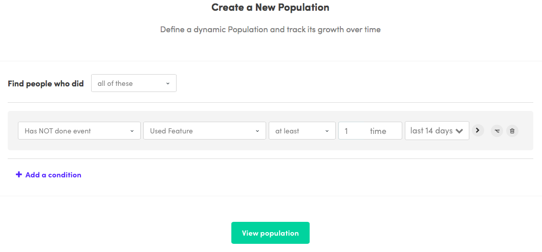
Now that we have our definitions, we'll monitor our unengaged users using Kissmetrics Populations and then target them using Kissmetrics Campaigns. Monitoring With PopulationsPopulations was created for growth/marketing and product teams to help them keep track of their growth cycle. With just a few clicks you'll be able to monitor the KPIs that matter to your company. For this post, we have to goal of shrinking our unengaged user base. So we'll create Population that tracks the users that have not used any feature in the last 14 days.
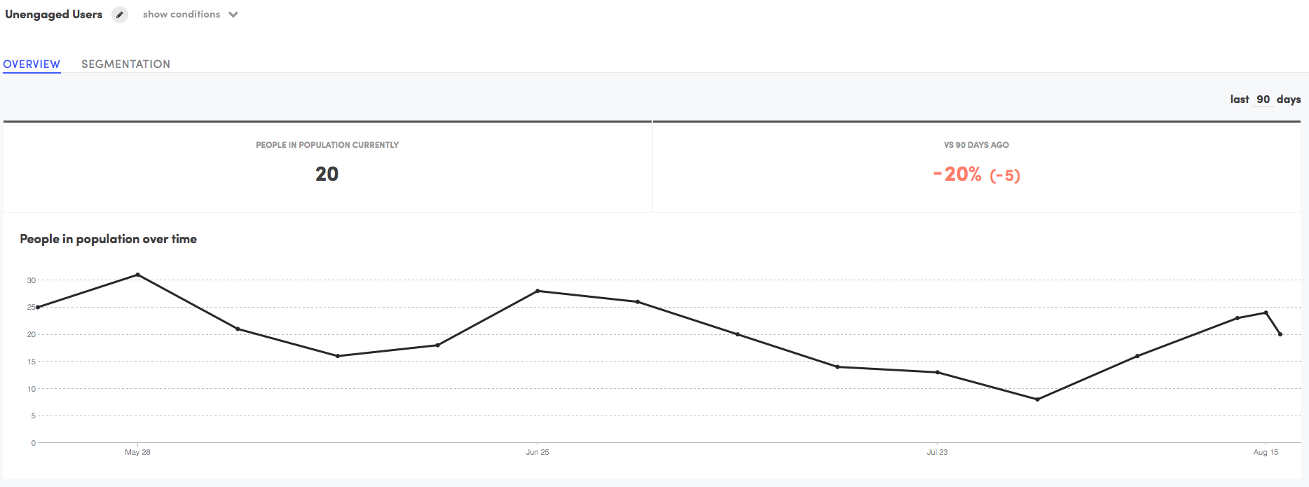
Let's see how many users are in this Population:
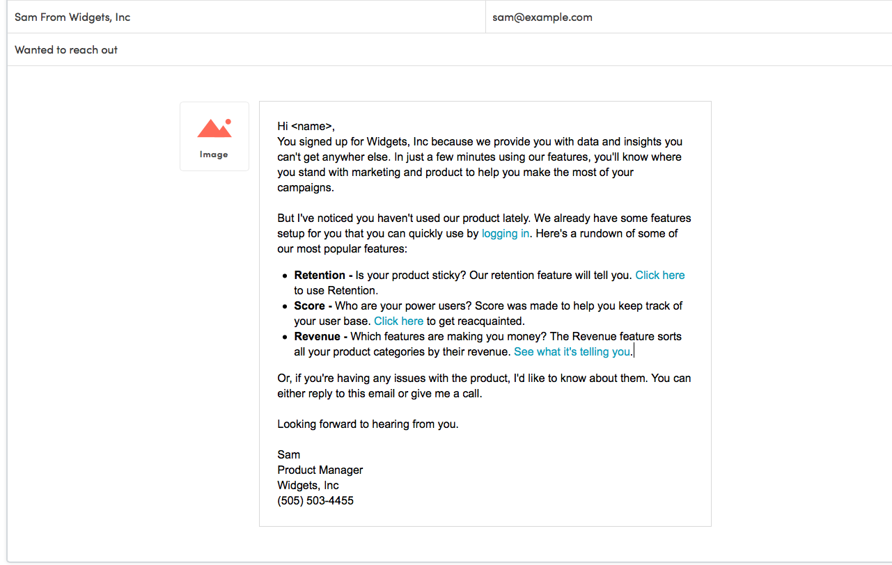
So we have our Population in place. Since these are our unengaged users, we'll want to reduce the number of people in this Population. Let's take our first step by creating a Campaign. Send Behavior-Based Email Messages Using CampaignsCampaigns is one of my favorite features in Kissmetrics. Once you find a segment of users that need to be nudged whether it's toward conversion, using features, logging in, etc. you pull up Campaigns and create the perfect email to nudge them. There are a number of things you can use Campaigns for. In this case, we're using it to get our unengaged users in the product and using the features. In Campaigns, we'll create a new email message:
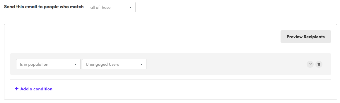
And we'll target the people in the Population we previously created:
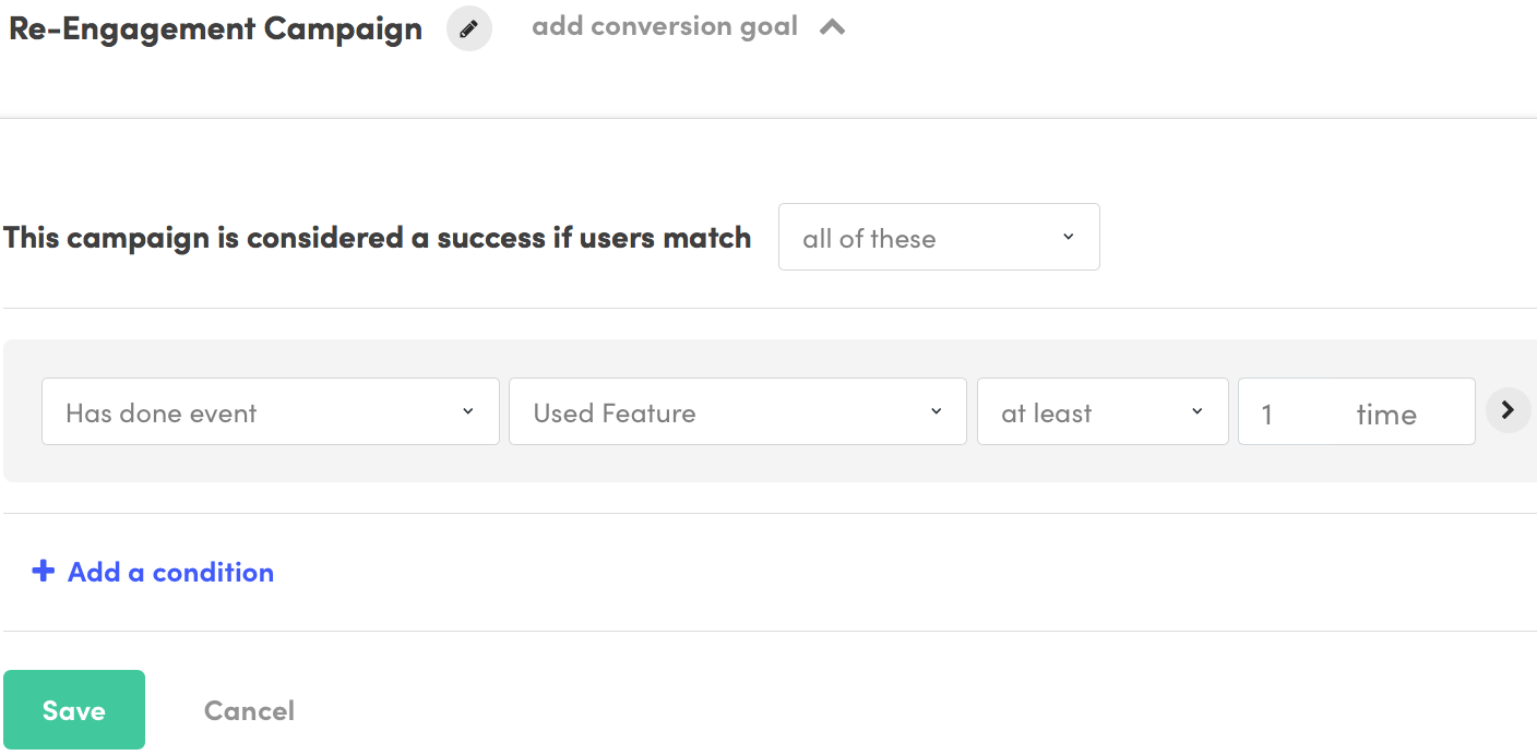
We'll then set our conversion goal. This means that we determine if the Campaign is successful if the users do a specified event. For us, that event will be Used Feature.
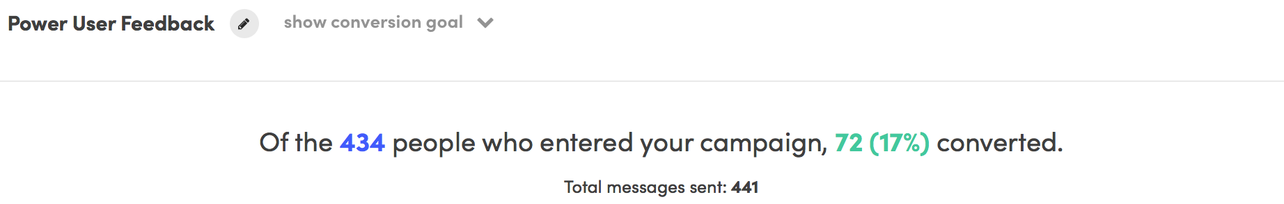
We'll then track the results in Campaigns, where it'll say how effective the Campaign has been. Here are the results from a different Campaign:
And we can't forget about Populations. Once we have our Campaign running, we'll check the Population to see if it's growing (bad) or shrinking (good). Minor InterruptionPrefer to just watch our promo videos for Campaigns and Populations? Just hit play below let's start with Populations: And Campaigns: ConclusionNo matter how sticky your product, there will always be a group of unengaged users. Even the ultra-addicting Facebook gets unengaged users. And how do they bring them back? Through emails. Don't believe me? Just get off Facebook for a few days (if you can) and you'll eventually receive the barrage of emails that come like clockwork. New friend suggestions, did you see person's comment person's status, person added a new photo, and you have 99 notifications, 5 pokes, and 3 new friend requests. All designed to get you Facebook (and countless other companies) send these emails because they work. Everyone has email, no one ignores their inbox, and well-written emails convert. About the Author: Zach Bulygo (Twitter) is the Blog Manager for Kissmetrics.
0 Comments
The machine learning-powered ad rotation setting comes front and center.
The post AdWords ad rotation settings to get trimmed: Optimize or don't appeared first on Search Engine Land. Please visit Search Engine Land for the full article. A search bar and multiple product listings are part of the update.
The post Google debuts giant new look for Local Inventory Ad product search in Knowledge Panels appeared first on Search Engine Land. Please visit Search Engine Land for the full article.
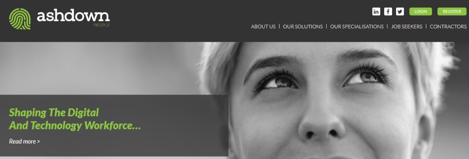
No, this headline isn't clickbait. This article does contain critical homepage elements that are often overlooked. And you might be ignoring them. In fact, the examples I share here are a sure sign that many marketers still ignore critical homepage elements. And conversions are lost for these simple reasons. I'm not going to rehash what you already know about homepages. You are a smart marketer. You already know a homepage is your website's front door. It's where most of your customers expect to find the #1 thing you do that can solve a specific problem for them. Okay, enough talk. Here are six homepage elements you're probably overlooking that are costing you conversions: 1. Homework (a.k.a. doing customer research)Homework 'on people', that is. And yes, it's a homepage element-because it shows when you do it well. Imagine this for a second: Your high school teacher assigns you homework and asks you to submit it in three days. For the next two days, you stay up late and wake up early to deliver your best. You faithfully turn in your homework on the third day. Question: How long would it take your teacher to score your work? A few seconds to five minutes. That's how long it will take to score something you worked on for days. It's the same with your homepage. Your homepage (or even any landing page for that matter) is like homework given to you by your target audience. It takes them a few seconds or minutes to score you, before deciding to bounce or stay. Homework shows on your homepage-because, if you do it, your copy will be saying what your prospects want to hear. If they land on your page and find that you're not speaking their language, it shows you haven't done your homework, and things can get ugly. You may even leave such a bad impression that they make a point of not going back. Example, Ashdown People-a firm specializing in HR for IT businesses:
If you're a tech firm who visits this page for the first time, here are a couple of questions you'd naturally have in mind:
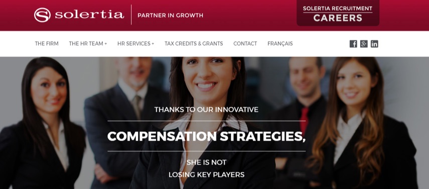
The page looks nice, but imagine the confusion its visitors may be experiencing. In contrast, take Solertia - another HR firm:
Their homepage copy speaks directly to a specific challenge folks running HRs face-developing compensation strategies to avoid losing key talent. This will catch the attention of an HR pro because it deals with problems that hurt and offers a solution. This is a good example of someone doing their homework. Whoever wrote this copy studied their audience well enough to find that 'developing strategies to keep key players in an organization' is a goal HR departments always try to reach. Doing your homework on your target audience reflects in your messaging. How do you do your homework? Talk to the very people that visit your homepage: customers. In other words, get feedback. There are great tools that will help you here, some of which include:
These tools will help you know your customers' pain points, goals and how they will need your product to solve their problem. Then, you'll be able to create a homepage (and even any other landing page) that speaks directly to those problems. Next, brevity and clarity. 2. Brevity and ClarityBrevity doesn't necessarily mean copy is short. It does imply there are no redundancies, and yet enough clever repetition to convince visitors to take a specific action. Chris Garrett, Chief Digital Officer at Rainmaker Digital, wrote that a landing page should be, as long as necessary. And no longer. That's brevity. As long as necessary. No longer. And clarity, on the other hand, is self explanatory enough. Is the problem you solve for your audience crystal clear? When your homepage doesn't briefly and clearly explain your offerings, people lose interest. It's that simple. Another case in point is where you have brevity on your homepage, but not clarity-a case where your homepage copy is brief, but it isn't clear how visitors will benefit from your business. A typical example of that is ZOHO's homepage:
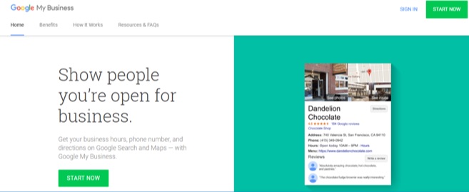
It's a well-designed page and it sure is brief, not much to read here. But to me, it lacks clarity. If, like me, you knew nothing about ZOHO before visiting their homepage, you have no idea what The operating system for your business OR A revolutionary all-in-one suite to run your entire business means. If you're curious, though, you might want to click the learn more link to find out. But according to some sites, Zoho gets about 18 million monthly visits. What if 400k, 1mm, 5mm of those monthly visitors aren't curious enough to click learn more? They were probably looking for a specific solution before landing on this page, and that's what they expect you to communicate to them. Your best bet is to communicate whatever you're offering in the clearest and shortest way possible. A perfect example of brief and clear is Google My Business' homepage:
In just over 20 words, with an image on the side, Google My Business clearly and briefly explains how they help your business get found when your brand name is searched. So brevity and clarity could mean five, ten, 200 words. What matters is that your page provides enough information for your visitors to become convinced and take action. And this why not hiring a good copywriter for your business is a terrible idea. A good copywriter will do enough dirty work to produce copy that has both brevity and clarity. 3. Active voice on CTA Buttons(Active voice describes a sentence where the subject performs the action stated by the verb.) In other words, a CTA button with active voice is one that says, This is what will happen when you (the visitor) click this. And active voice goes beyond just using verbs on your CTA. It's easy to think that all visitors understand what a colored CTA button means, but you'd be surprised. Sign-Up.to recently mentioned in their study that Images are good, but it's not always clear that the image is also a call to action. Just because you have a colored button on copy doesn't mean visitors know where the button will lead when clicked. Example:
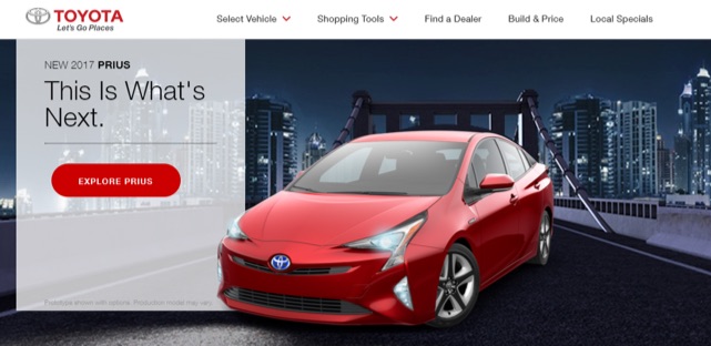
Where will Click Here lead when clicked? Is that button for a call, an email, or a link to another page? You need to let people be certain what your button is for, or you risk confusing people. Here's a perfect example of that from Toyota:
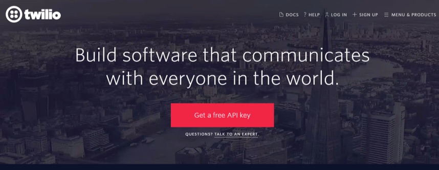
Explore Prius is active voice. It says exactly where the CTA will lead after it's clicked-a page where you get to explore the Toyota Prius. That's active voice in action. Don't put your visitors in a position where they're not sure what your button is meant for. Make it as descriptive as it needs to be - Explore [my product], See a demo, Check out this case study, etc. 4. Specificity Over HyperboleWhy not hyperbole? Because overstating can lead to visitors questioning your sincerity. Instead, use copy that specifically communicates how you actually add value to people's life and businesses. Twilio's homepage is a good example:
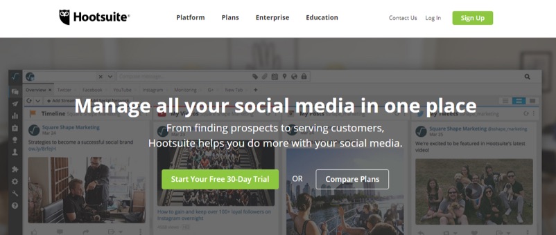
Twilio is a tool that software developers use to add communication capabilities to the applications they build. And that's exactly what they explain in the homepage: Build software that communicates with everyone in the world. No overstatements. No hyperbole. Just the specific problem Twilio solves for people. Hootsuite's homepage is another good example:
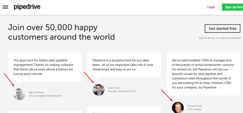
According to SEMrush, Hootsuite gets about 7.2 million monthly visits. That's impressive; yet, there's no mention of how big they are on the homepage, but a brief and clear explanation of how their product solves problems for people. Adding hyperbole to your copy doesn't communicate any value. ConversionXL Founder Peep Laja says it this way (54:21): You don't add life to copy with hyperbole. [For example,] 'We have the best pizza in town VS. We deliver pizza in 10 minutes'. [Pick] specific [over] hyperbole. 5. Testimonials With Smiling or Happy FacesTestimonials are powerful already, but one with a smiling face pictured? Terrific! One Swedish study reveals that your smile has a huge effect on people around you - try smiling at someone and you'd see they almost couldn't help but smile back, unless they consciously don't want to. Amazing, eh? Did you know? With the Kissmetrics A/B Test Report, you can see how a test impacts any part of your funnel. Running a test on your homepage and want to see how it affects lead quality at the bottom of the funnel? Find out in 10 seconds with the A/B Test Report. Pipedrive laid emphasis on the fact that their customers are actually happy people. Then they put those happy, smiling faces about 40% down their homepage.
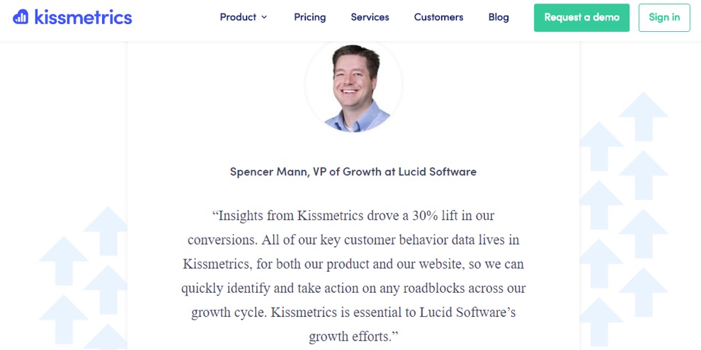
Kissmetrics understands this concept as well:
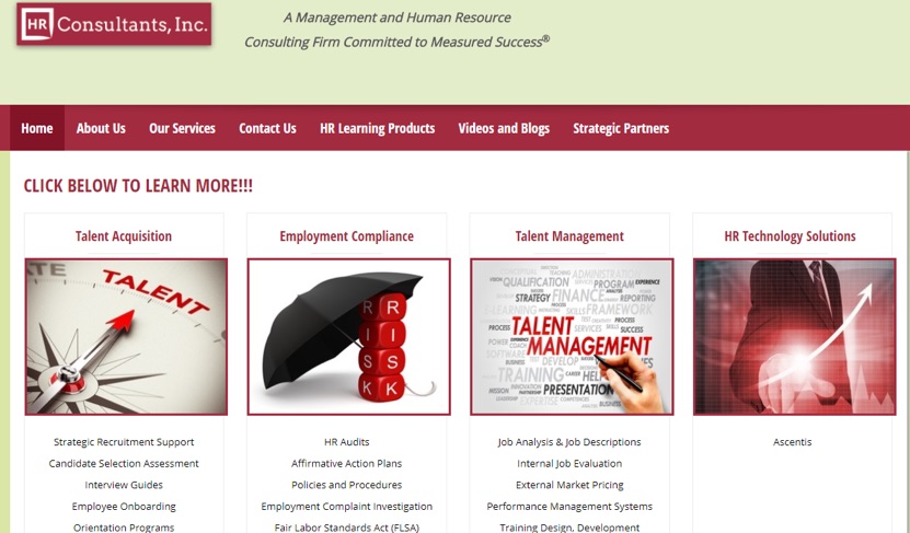
So, if you're going to use testimonials with customer headshots, use those that are smiling already since they have a positive effect on viewers. 6. One Page, One GoalYou'd think every marketer by now gets the concept of one page, one goal, until you see a homepage like this in 2017:
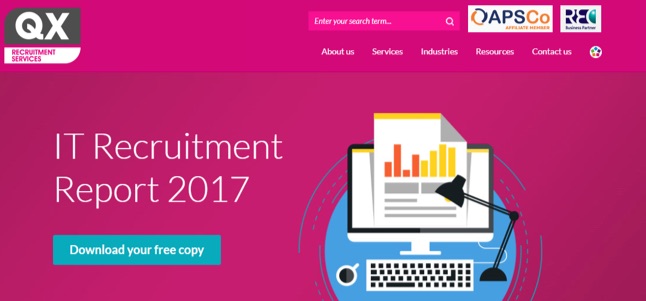
Several CTAs on one page. What's the one goal that a page like this is trying to achieve? Virtually everyone would have no idea. And several studies have proved it's far better to use one page for one result. The more specific you are, the better you'll be at converting specific visitors. A good example of a homepage with one goal is this one on QX Recruitment Services:
In contrast to HR Consultants homepage (above), this one has only one goal. Which means if the homepage gets 2000, 5000, 20000, etc. monthly visitors, this report will be the number one thing catching their attention. And it's the only action they're first asked to take. Brilliant. This way, QX Recruitment Services know how to measure the homepage's success - it's as successful as the number of downloads the report gets. Start Converting With Your HomepageIf you're going to have a homepage (or even any landing page) at all, you want to ensure it drives optimal conversions. And the tips above have hopefully inspired you to make specific corrections on your homepage, or even create a compelling one from scratch. About the Author: Victor Ijidola is a conversion-driven freelance writer and content marketer. Need help with landing pages, ebooks, blog posts, guest blogging, email newsletters, etc? Contact him at Premium Content Shop.
|
ABOUT USTargeted Laser SEO provides SEO for surgeons, lawyers, and medical entrepeneurs, medspas, and spas. With an emphasis on local SEO and affordable SEO service packages for our clients, we are able to combine cutting-edge and innovative strategies to help our clients get ranked online in the most advantageous positions. Archives
June 2019
Categories |


 RSS Feed
